Tutorial | How to Make Watercolor Swatch Cards
WHY I DECIDED TO MAKE NEW SWATCH CARDS
In my studio I used to have an entire flat file drawer devoted to watercolor swatches. It was a crazy, insanely haphazard mess of half legible notes, usually scribbled on the back of random scraps of watercolor paper. While I loved that drawer and all the little treasures it held, it was also about to drive me insane and after searching for a particular color note for almost an hour one day, I realized that my watercolor swatch system needed a major upgrade. The entire reason swatch cards are incredibly important in my studio practice because they show me how each watercolor will perform on my chosen paper surface, which is not standard information you will get from looking at the color chart from the manufacturer because watercolor is transparent, meaning it’s characteristics can vary quite drastically between different brands of paper due to undertones and surface texture. Which is why for me, these swatch cards are a crucial part of the process.
Time has always been against me on this project, but since it’s almost a month into quarantine, now kinda seemed like the right time to finally get around to actually doing the damn thing. My collection took an entire day from start to finish, which for 200+ watercolors I didn’t think was bad at all. It was a nice mental break from all of the crazy to just focus on one task for a day. I started the endeavor in the morning with a hot cup of tea and podcasts chattering away in the background, but things quickly escalated and by midnight I switched over to a glass of bourbon and blaring country music….which pretty much sums up my life and studio vibes in general. For me the process of making the swatches and applying color is a methodical practice that is very relaxing, but that being said I’m a draftswoman and being meticulous is kinda in the job description, so it was time I enjoyed immensely.
A lot of you were also interested when I posted them in progress over on my Instagram stories and I had several people asking questions or just curious about the process in general. Granted some of them were in regard to my sanity for swatching my entire watercolor collection at once, but there were also a lot of people genuinely interested in why I was doing this and how I find this process, tedious as it is, benefits my studio practice. Which is why I decided to take the time to put together this post in the hopes that you’ll get all the information you need to design and make your own swatch cards, so read on to find out why you should make watercolor swatch cards, what I think makes the anatomy of a good swatch card and get my watercolor swatch template, supply list and a step-by-step run down of the process to make your own.
WHY SHOULD YOU MAKE WATERCOLOR SWATCH CARDS?
Know the Characteristics of Your Paint | The first reason this is a great exercise is that it familiarizes you with the different characteristics of pigments and paint brands. I’ve found through my own personal experience and many years of teaching that if you don’t have a firm knowledge of your materials you’ll flounder a bit more than necessary and in the end only make things harder on yourself. As you work with different types of paint you’ll get a feel for the ones you enjoy using and the ones that you could live without. You’ll also quickly realize that some pigments go on smooth while others love to granulate and create irregularities as they dry, you might love one brand of paint and loathe another, you’ll notice some brands are super thick and others feel more suspension based…the list goes on, but all of this knowledges will help make your studio practice more efficient in the long run.
Observe How the Paint Reacts to Your Substrate | Watercolor is inherently transparent, which means it’s extremely reactive to the surface you put in on. This why its important to know how the watercolor will react to the surface you intend to use in your finished drawing or painting. Paper can come in a wide variety of surfaces from smooth to rough and can also have different undertones ranging from natural to extra white. This means that the beautiful little swatches you see on the brand’s website aren’t always going to accurately reflect how that paint will operate on the paper surface and tone you’ve chosen. As an experienced artist this is the main reason why I still swatch my watercolors - I want to see exactly how it’s going to look on the surface I’m making my work on and because I use the same brand of paper religiously its easy to use leftover scraps for my swatches.
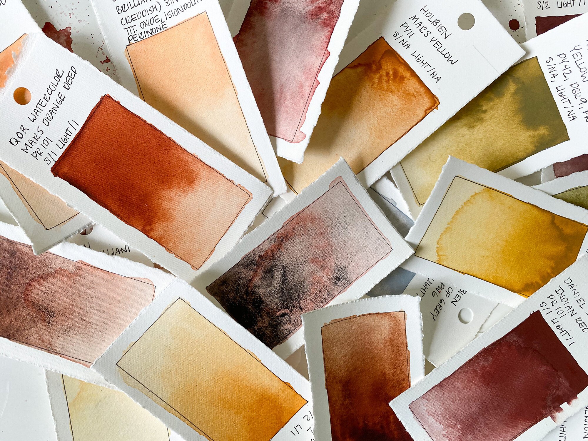
Swatch Cards Make Developing Color Palettes a Breeze | What happens when you have lots of beautiful little swatch cards on hand? You can easily and efficiently put together color palettes by mixing and matching different swatches. It’s not only a great way to visualize palettes when planning work, but its also a great way to tell if the color you’ve chosen will match the one from your source image or the color you happen to have in mind for that composition.

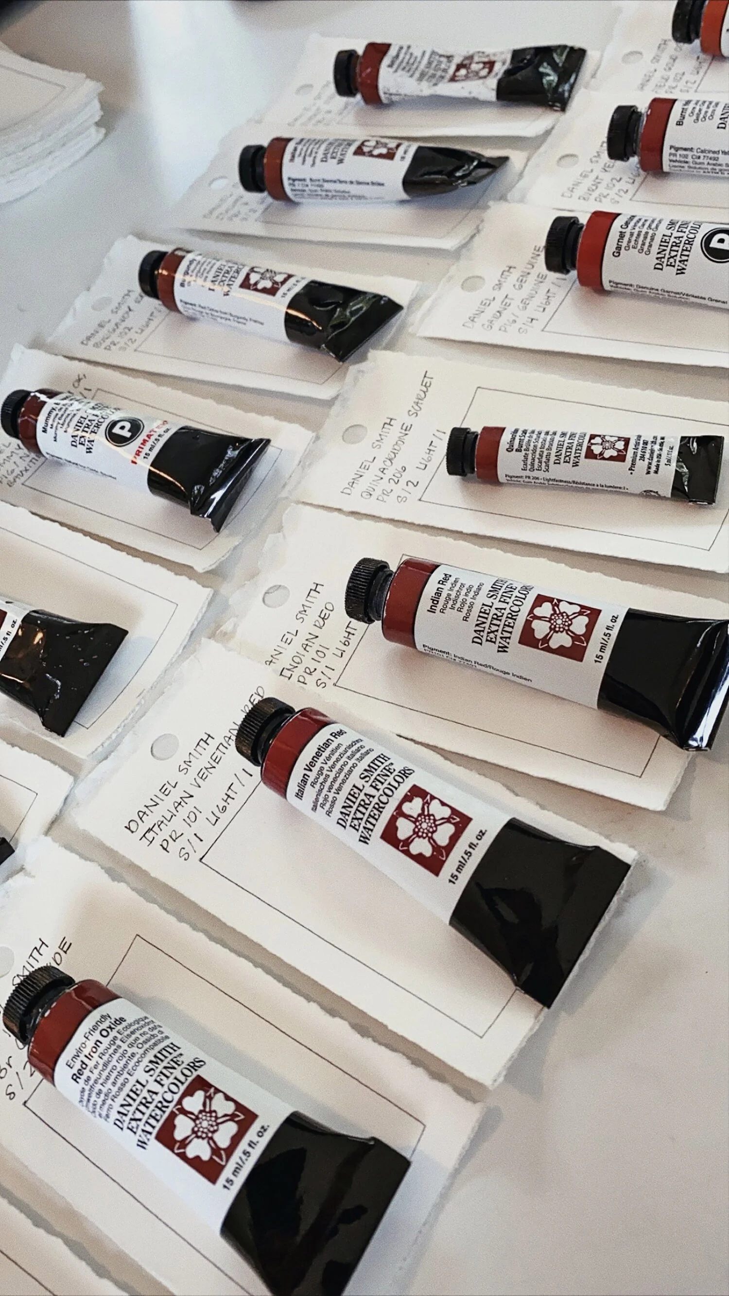
Creating a System || Here you can see my system for processing the swatch cards. The row on the left has paint tubes waiting on top of their individual cards so that things don’t get confused. Row on the right is in the process of drying.

Dry Swatch Cards || Here you can see a pile of similar color swatch cards. Having each color on it’s own individual card makes it super easy to mix and match colors to create your palettes. Mug by ceramicist and sculptor Deighton Abrams.
ANATOMY OF AN INFORMATIVE SWATCH CARD
Paint Brand/Manufacturer | It’s important to know which brand your paint is from because paints with the same color name can vary quite dramatically due to different paint formulations and pigment combinations. It also helps when it comes time to repurchase colors you use frequently to know what brand you’re looking for.
Color Name / Marketing Name | Potentially the most misleading piece of information on that little tube of paint in your hand. Paint names do not conform to any color or pigment standardization, you will often find that two different companies can manufacture the same paint labeled as “Burnt Umber,” but each will have a wildly different combination of pigment(s) and binder. Another reason this is important to write down is that each brand carries a lot of different paints within the same color (hue) family. You might have bought a red paint in the past, but unless you know the exact name of that paint (along with the brand) it will be hard to remember which of the 10+ variations of red it actually was.
Pigment Numbers | I can almost 100% guarantee that if you went out and bought several different tubes of “Burnt Umber” watercolor you could look on the back of each tube at the pigments used and they would all be slightly different. The reason I say this with certainty is because I just did a ton of different brand/color comparisons while executing my own swatches. That’s because there is no standardization in what goes into a typical color name - each brand develops their paints based off the specific pigment types and combinations for that they perceive to best represent that specific name. This isn’t necessarily a bad thing, but these variations are the reason I always recommend writing down the pigments numbers on the swatch card. It will also help you identify other paints made with or that reside in the same pigment family.
Series # | The series number tells you how expensive that paint was. The lower the series number is (say Series I) the less expensive the paint will be because the pigments that go into that paint are cheaper and easier to obtain or manufacture. As you go up in number to (say Series III - IV) the more expensive the paint becomes because the pigments are more expensive and harder to obtain or manufacture. The reason I like to include this is because when I finish a tube of paint its handy to set that swatch aside and then every couple months I go through and make a shopping list to see what is actually worth repurchasing or not.
Lightfastness Rating | The lightfastness rating of a pigment is based on its resistance to change on exposure to light. This gives you an idea of the length of time a pigment will retain its original color, which means it gives you an idea of how long your work will retain its vibrancy and lifespan unprotected (meaning without varnish). The reason this is important is that you want your work to retain its integrity for the longest amount of time possible and using tested pigments is one way to do this. Rating systems can vary from brand to brand, but traditionally a rating of Lightfastness I means that the pigment has a rating of Excellent Lightfastness, while a rating of III or higher means you have Fair to Very Poor Lightfastness and that there is a lot of change in that pigment when exposed to light. Try your best to stick to a Lightfastness rating of I to II.
Opacity / Transparency | Opacity means that when the paint is applied you can’t see anything through it and it has a strong hiding strength or covering power (think full coverage foundation.) Transparency means that you can still see anything that is underneath the paint after it has dried (think tinted moisturizer.) Most paints will fall somewhere along this spectrum between the two. The black pen line boundary on my color field in the swatch cards is there to test the opacity or transparency.
Granulation | The pigments suspended in your watercolor will usually do one of two things - produce a nice smooth and even wash or cluster together to create beautiful texture and mottled washes. You’ll notice as the paint dries that heavier pigments settle into the paper first while smaller ones take a bit longer. These textures are one of the unique characteristics of watercolor as a media and will help you pick paints that are suited to whichever surface application you need. Most pigments will do this regardless of how careful or smooth you apply the paint, which is why I’ve just chosen to use the color field and gradient to note the granulation properties of each paint.
Staining Properties | The staining properties mean that once the swatch has dried you then go back with a damp cotton swab and see if you can lift some of the color back off the paper. If you can that means it has a low staining capacity and that the paint may not work well for glazing techniques. This one is easy to go back in and test at a later date and test on an existing swatch if need be. Now this is one I didn’t include in my swatches mainly because it’s not something I’m overly concerned with in the process I use for my work, but depending on your process may still be of interest to you.
EXAMPLES OF GRANULATION AND OPACITY / TRANSPARENCY

Granulation Examples || Here you’ll see the difference in granulation between two different watercolors. The Hematite Violet on the left has lots of nice heavy pigments that settle and separate so it is a high granulation paint, while the Brilliant Yellow (Reddish) on the right has a nice soft and smooth application that makes it a low granulation paint.

Opacity / Transparency Examples || Notice the black pen that defines the color field? The reason I chose to use black pen to mark this area and then clearly not stay entirely within the bounds was so that I could test the different level of opacity or transparency in the paint. On the left you’ll see a very transparent paint, the middle is a semi-transparent and on the right is a gouache that is opaque.
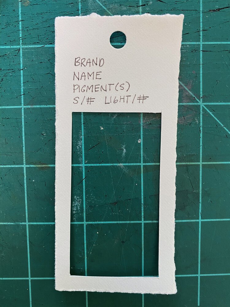
BASIC WATERCOLOR SWATCH CARD TEMPLATE
When researching how other artists have done this I found a lot of different methods, but none of them really fit what I needed…so I decided to make my own. Below you’ll find the template I used for my swatches and one thing you’ll notice that its pretty simple, no bells and whistles. I wanted an effective template and system that was quick to replicate and execute anytime I needed to add colors into my collection and for me, this is it.
Notes | You’ll notice that the brand, color/marketing name, pigments, series and lightfastness are all included on the top of the template, I consider all of these to be basic and essential information about the paint. I chose to make several elements serve the same purpose for the sake of simplicity - to test the opacity/transparency I use the waterproof pen that frames the edge of the color field and the color field itself to show the granulation, so there’s really no need for it’s own separate section. The one thing I did choose to omit was the staining property, simply because its not really something I use often and if I do need to test it I can always come back and do it at a later date.

SUPPLY LIST
TO PREP YOUR SWATCH CARDS YOU WILL NEED:
Pencil
Ruler
Watercolor Paper (140lb.)
X-acto Knife or Paper Cutter
Waterproof Pen (Zebra or Micron)
Hole Punch (Optional)
TO MAKE YOUR SWATCH CARDS YOU WILL NEED:
Pen
Watercolor Paint
Watercolor Brush
Jar w/ Water
Paper Towels
Notes | Don’t feel like you need to go out an buy a ton of paint or supplies, any brand of watercolor paint or paper that you prefer to use works just fine for this. I have at least six different brands that I ended up swatching as well as some gouache, but this was a collection several years in the making. Most of the other supplies are basic items that should be in any studio, home or design kit. If you don’t have one or two items, then get creative and use what you have on hand!
TIP | It’s best to use the same type of watercolor paper that you’ll be working on for your finished piece. If you aren’t sure what type of paper you like to work on a good exercise would be to pick a few different brands, surfaces, weights and undertones, then pick one tube of paint (either your favorite color or one you’re already familiar with) and do a swatch test of that color on each of the different papers to see how they look. Usually you’ll have a pretty clear idea of which brand/type/surface of paper you’d like to work with after doing this exercise.
STEP-BY-STEP PROCESS OF MAKING SWATCH CARDS
PREP YOUR PAPER FOR THE SWATCH CARDS
Supplies | Gather your supplies and organize your work area. Art (just like woodworking or cooking) works best when you have everything organized and ready to go.
Measure | Use your pencil and ruler to mark off the measurements for your swatches. Either use the measurements from the template above or make your own using the information or size that you need.
Cut/Tear | Use either a x-acto knife to cut your swatches or a metal ruler to tear down the paper.
MAKE YOUR TEMPLATE
The template is designed to give you consistency in the size of the area you are applying the color (color field) and also save you a lot of time measuring out each individual swatch. I recommend making this template either out of the same paper or using some thin cardboard, either way it should be thick enough to hold up to repeated wear and tear.
Scale Template | Make your template the same size as your final swatches will be, this makes it easier to line up quickly edge to edge.
Measure Color Field | Determine the scale of your color field area and measure in to define your borders. I recommend leaving no less than 1/4” border or else the edge of the template won’t hold up to repeated use.
Cut | Now take a X-acto knife and cut out the area designate for the color field.
Notes | Write down all of the standard information you want to include on the top of the card so that you have it for future reference. On the back I also wrote down what pens I used to lay out the color field (Zebra Pilot) and to write the notes with (Lamy Safari w/ Monteverde Smoke Noir Ink).


PREP SWATCH CARDS FOR COLOR APPLICATION
Trace Template | To use the template simply line it up with each swatch card, take a waterproof pen and trace the color field onto the swatch card.
Punch Hole | If you want a hole in the top for hanging to attaching to a ring go ahead and do that now. I just used the middle of a binder hole punch for mine.
APPLYING NOTES & COLOR TO SWATCHES
Organize Paint | If you are working with a lot of watercolors take a minute to line up all of the watercolors and set each tube on top of the swatch. This will help you avoid any confusion down the line and keep things neat and orderly. I organized mine by hue so that I wouldn’t have to change my water as much.
Make Notes | Next go tube by tube and use the information on the tube of paint to make your notes. If the information is not available on the tube then you can usually go directly to the brand’s website to find it. Scroll to the bottom of this post for links to each brand I used in my swatches watercolor info.
Apply Color | I applied my color directly from the tube for the top mass portion in order to get a thicker application and heavier coverage, then dipped my brush in water (dabbing off any excess on a paper towel) and gradually lightened the color down to the bottom of the swatch.
Let Dry | Set aside and let dry for at least an hour before stacking.

NOTES
Customizing Your Swatch Cards | I recommend taking the time to look at what characteristics are important for you to have at the ready and use those on your swatch cards. You can also write notes to yourself on the back of the cards as well.
Extra Cards & Mixtures | Taking the time to make more cards than what you need will make it much more efficient to quickly swatch new colors and immediately add them to your collection. You can also use these to swatch any particular color mixtures that you would like to remember.
Organize + Display | There are several options to organize and display these swatch cards. Some artists use binder rings and group them by brand, hue or temperature and others choose to put them in plastic sleeves, but I think my method of choice for these will most likely be to make a swatch card wall in a corner of my studio so that I can keep them out for quick and easy to access. They also look real pretty too, so why not?
Hope you enjoyed this post and the process of making these as much as I did! Sometimes you just need something slow and methodical to help take your mind off all the things swirling in the world around you, and for me this was it. Below you’ll find links to the watercolor charts from different brands I used in my swatches, they will take you directly to the information you will want to include on your swatch cards. If you have any questions, used this template or were inspired to create your own I’d really love to see how they turned out, so feel free to tag me on Instagram or comment your thoughts below!